The bigger the better?
During the Simply Scrivener Special webinars, I share my screen so that I can demonstrate various features of Scrivener.
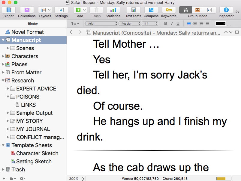
One issue that arose early on was visibility. Consider this view of my Safari Supper novel. 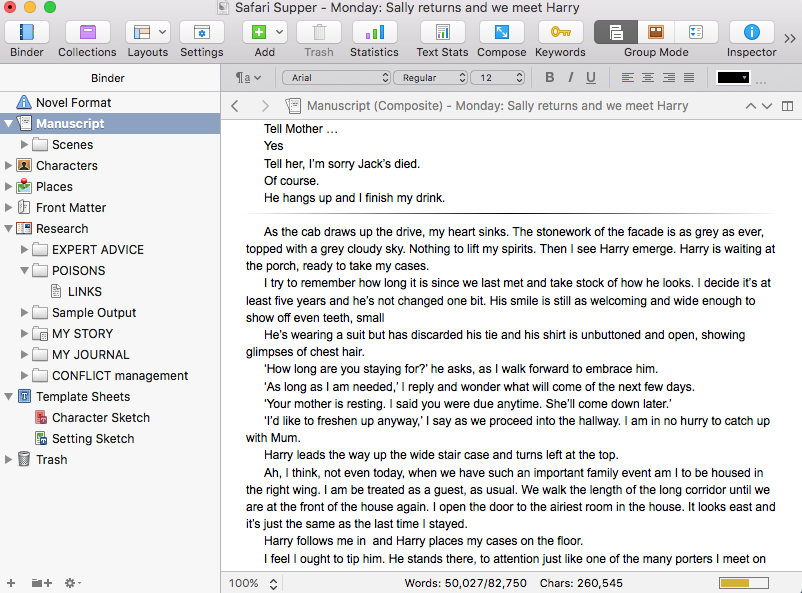
Shared across the Internet, with my attendees watching on screens of various sizes, immediately the cry went up: ‘I can’t read the words.’
Changing the size of the text within the Scrivenings pane is easy enough.
Notice the 100% with two arrows in the bottom left corner? Click here, and choose a bigger percentage, and the text size increases.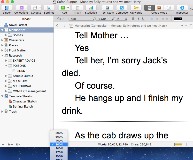
As I say, easy! But then, another request came: ‘What about the text within the Binder pane?
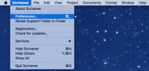 Ah … that took a little bit of investigation, but here’s the solution. Select Scrivener / Preferences.
Then, choose the Appearance tab and, within the Fonts section, decide what font size will suit you and your audience.
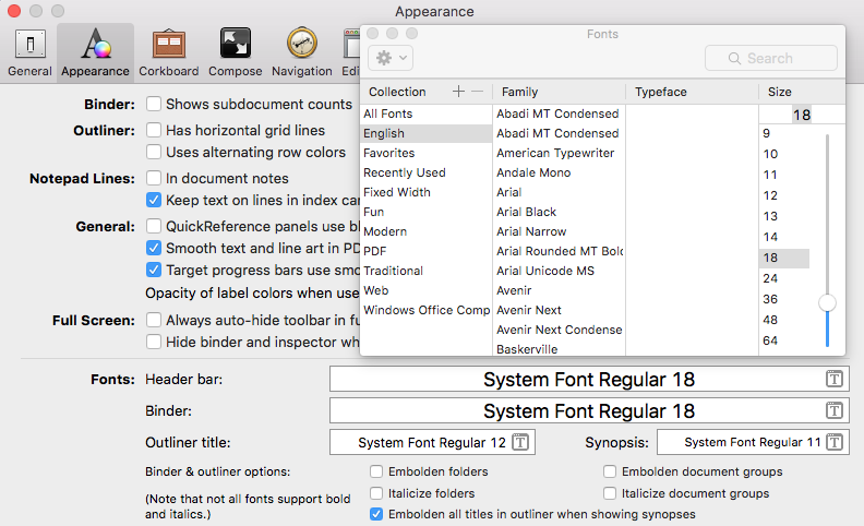
Hey presto! The visibility problem disappears.
Need help?
Book a Simply Scrivener Special.
The ScrivenerVirgin blog is a journey of discovery:
a step-by-step exploration of how Scrivener can change how a writer writes.
To subscribe to this blog, click here.
Also … checkout the Scrivener Tips
on my ScrivenerVirgin Facebook page.


Denise Brixey
7 June 2016 at 18:30Thanks, Anne! I’ll be able to fix it myself without bother you to stop the webinar!!
rainbowmaker
17 June 2016 at 16:48Not a problem Denise. Happy to oblige. Hope to see you at a Simply Scrivener Special webinar again soon.
Patsy
7 June 2016 at 15:29Varying the size like that seems to help with editing and proofreading, especially when we’ve read the piece several times.
rainbowmaker
17 June 2016 at 16:49I agree – it’s hard enough to find one’s own mistakes as it is!