
Scrivener 3’s revised user interface – The corkboard options
It’s all about the Corkboard!
The Editing pane can show your Scrivenings, your corkboard or your outline view. In the previous post, I looked at the bottom line of the Scrivenings; next time, I’ll focus on the Outline view. Today, it’s all about the corkboard.
The corkboard bottom line: comparing Scrivener 3 with Scrivener 2
In Scrivener 2, the corkboard bottom line looks like this.
![]()
On the left, there are five icons/displays – and, on the right, there are three icons.
In Scrivener 3, there are a few changes in the design of some of the icons and one additional feature on the right-hand side.
![]()
The corkboard bottom line – working from the left
The + sign is used to create a new document. The only difference between Scrivener 2 and 3 is the design of this icon.
The folder icon with a plus sign is used to create a new folder. This is also a redesigned icon.
The cogwheel reveals a drop-down menu. There are a few differences between what’s available on Scrivener 2 and 3. This is the drop down for Scrivener 2.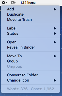
This is the drop down for Scrivener 3.
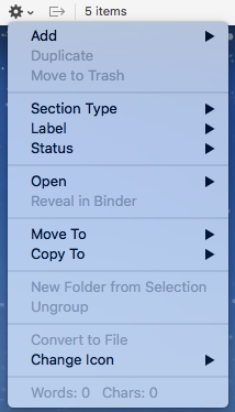
I’ll explore the slight changes in a subsequent post … ‘Section Type’ warrants at least one blog post all by itself!
![]() The next symbol shows three sides of a square with an arrow pointing to the right. This tool is only available when you have split panes. Then, if activated, when you click on one of the corkboard cards, Scrivener automatically opens the selection in the other editor. So if you want to flick through the cards, on the left (say), on the right, you’d see the text for the selected document. If you have split panes and you don’t want this to happen, make sure this option is turned off (greyed out rather than blue)!
The next symbol shows three sides of a square with an arrow pointing to the right. This tool is only available when you have split panes. Then, if activated, when you click on one of the corkboard cards, Scrivener automatically opens the selection in the other editor. So if you want to flick through the cards, on the left (say), on the right, you’d see the text for the selected document. If you have split panes and you don’t want this to happen, make sure this option is turned off (greyed out rather than blue)!
Then there is a count of the number of items.
The corkboard bottom line – on the righthand side
![]()
![]() On the right, there is a pair of grouped icons – the only difference between Scrivener 2 and 3 is the design of the icon. And the fact that the label which appears if you click the right-hand one says ‘Commit’ (S3) instead of ‘Commit Order’ (S3).
On the right, there is a pair of grouped icons – the only difference between Scrivener 2 and 3 is the design of the icon. And the fact that the label which appears if you click the right-hand one says ‘Commit’ (S3) instead of ‘Commit Order’ (S3).
The exciting change in the corkboard is the option to arrange the cards on your corkboard by the label.
The ‘normal’ way is as a grid. In Scrivener 2, the default is on a background that looks like a corkboard.
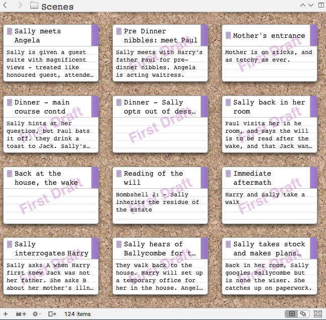
The default background for Scrivener 3 is plain. (You can change it, and Scrivener 3 offers additional options too – that’ll be another post!)
Here, I’ve used colour coding (with Label indicating POV).
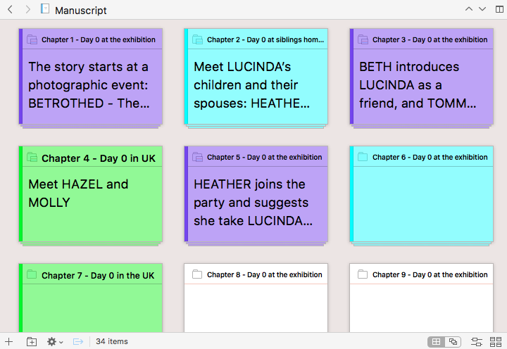
Clicking on the new icon results in the cards being presented as if threaded on strings, with each string representing a different label (in my case, POV). Notice the top string has no colour – that indicates the document has yet to be given a label.
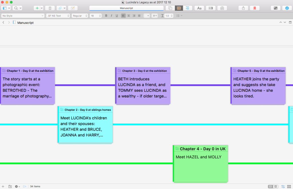
![]() You can, if you wish (and I prefer this), opt for a vertical layout. In the bottom line, where we had the ‘commit’ choice, there is now an icon with an orientation choice.
You can, if you wish (and I prefer this), opt for a vertical layout. In the bottom line, where we had the ‘commit’ choice, there is now an icon with an orientation choice.
What are the benefits of this new corkboard feature?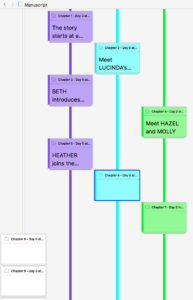
If like me, you are writing a story from more than one POV, it’s important to deliver the chapters in such a way that the reader understands the ‘pattern’. This doesn’t have to be rigid but, if you alternate, then the reader begins to anticipate a change of POV at each chapter end.
In my Lucinda’s Legacy, I have three POVs and, as you can see, they do alternate. The ‘main’ storyline of Lucinda’s first-person account (in purple) alternates between the others. The blue/cyan thread is my third-person narration, and the green indicates Molly’s POV.
With this new feature, I can see at a glance how the chapters fit together.
Notices also again: the cards which have no colour, on the no-colour thread. At some point, I can decide whose POV applies for these unlabelled cards. I could go to the Inspector and apply the label – or I can drag the card into the appropriate thread.
And, if I decide I need more of the third-person narration, I can add another card and drag it into position.
I think this is a wonderful invention.
With some of my NaNoWriMo novels, I’ve planned the whole thread for one person’s POV and only then interspersed with another POV, if I’ve felt it would serve me well. With one of my earliest NaNos, I had a front story (what happened from the day a man died onwards) and a backstory (infilling why he was murdered and how the deed was done). I was writing in Word (!) and had dreadful problems trying to work what to reveal and when. With this new feature in Scrivener, I can ‘see’ the shape (front story versus backstory) and move cards about until it’s just how I need it.
Now, skipping to the righthand icon … again, there is very little change. there are controls for card size, ratio, spacing, cards across and keyword chips.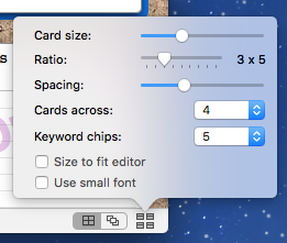
The only difference is that Scrivener 2 (above) offers the option ‘Use small font’ and Scrivener 3 (below) – it appears – does not.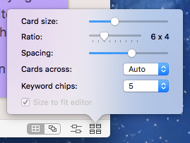
However, in Scrivener 3, if you select Scrivener / Preferences / Appearance and the Corkboard pane, you have greater choice than in Scrivener 2, for how the card heading will appear. I had great fun tweaking the font size and, if I didn’t have a deadline to finish writing this blog post, I’d still be playing with shadows and opacity options!
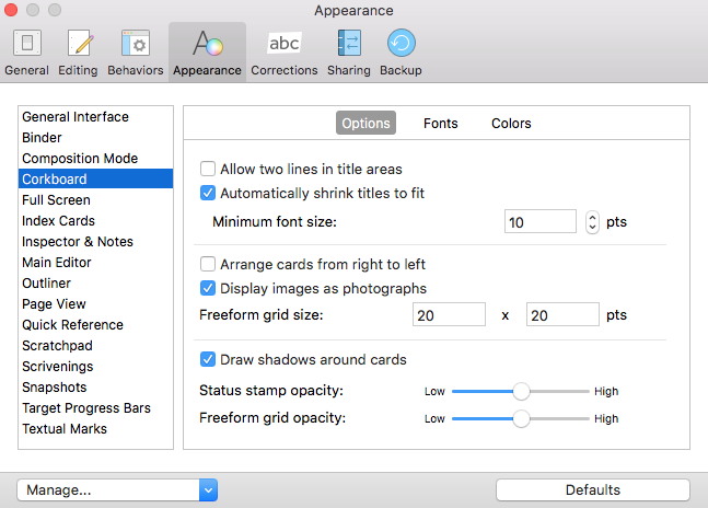
Phew! For me, this glide across the bottom of the Corkboard introduced me to a number of features I’d never used before. And convinced me (if ever I needed convincing) that Scrivener 3 is THE tool to use when writing a novel. Or anything else, come to that …
Questions about Scrivener? Need a helping hand? Want a demo?
To watch me go through the process of customising the Corkboard view, and all these features, or to ask any questions, book a Simply Scrivener Special.
To help me to prepare, you could also complete this short questionnaire.
The ScrivenerVirgin blog is a journey of discovery:
a step-by-step exploration of how Scrivener can change how a writer writes.
To subscribe to this blog, click here.
Also … check out the Scrivener Tips
on my ScrivenerVirgin Facebook page.


????
9 January 2023 at 17:30Scrivener day 1!
Thanks for this overview of the corkboard. How do I change the font and its size on the cards?
Anne Rainbow
9 January 2023 at 17:45This more recent blog post explains: https://www.scrivenervirgin.com/2020/07/editing-pane-options-corkboard/ (If you go to the Scrivener Index – https://www.scrivenervirgin.com/index-scrivener-posts – choose the most recent post for any topic. If need be, I’ll refer back to earlier posts.)
Saeed
11 July 2018 at 06:21Wandering if can use for character reltionships
Anne Rainbow
11 July 2018 at 06:45You could write on each card what you REVEAL about the relationships, mentioning both names. Then create a collection of scenes which include REVEAL relationship between X and Y in the synoptis. You’ll then be able to check for continuity of those scenes in how the relationship develops.