
Scrivener 3’s revised user interface – The bottom line
Bottom line?
We looked already at how the top part of the user interface has changed. See this blog post.
Today, it’s time to examine the bottom line. Working from left to right …
The bottom line beneath the Binder
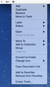 There are three icons in the bottom line beneath the Binder in Scrivener 2:
- A plus sign (which creates a new document)
- A folder, with the plus sign by it/beside it (which creates a new folder document)
- A cogwheel which, if clicked, opens a drop-down menu.
This is the drop-down for Scrivener 3.
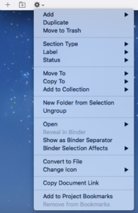
Comparing the two drop-down menus, there are slight changes in what’s on offer … but most of it is the same, even if in a different order.
Clearly ‘Section Type’ is worth investigating; as is ‘Show as Binder Separator’ … and some others; they will appear in a subsequent post.
Bottom line beneath the Editor pane
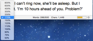 In Scrivener 2, there are three areas in the bottom line beneath the Scrivenings version of the Editor pane:
- The ‘change the text scale’ control, which offers a drop down with values from 50% up to 800%
- The word count and character count
Because I had set a target, this shows my progress: 286 words out of the target to 500.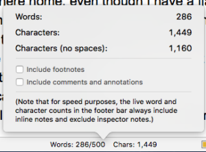
If you click on this area, some text statistics are displayed. However, this only repeats what you already know – the live count – and offers you the option to include footnotes, comments, and annotations.
(The text statistics are in addition to the Project Statistics which are available via the menu system: Project / Project Statistics.) - A progress bar showing the fraction of words I’ve written towards my target – mine is showing orange which is the default colour (not red which is seriously below target and green which indicates ‘done’). You can change these colours, if you wish, via Scrivener / Preferences / Appearance / Customisable colours / Target progress bars.
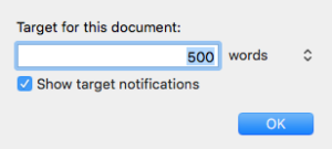 A bull’s eye which if clicked opens up the Target window, where you can set or reset the target
This is useful if you are creating an outline ahead of NaNoWriMo and want to allocate the 50K words across your various scenes. To learn more about this strategy, read this post from the 2017 Nano preparation period.
In Scrivener 3, there are still three basic areas.
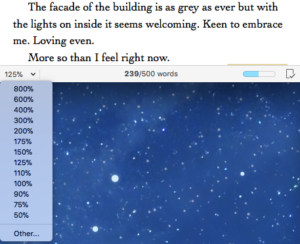 The ‘change the text scale’ control on the left-hand side offers an additional option: Other. If you click on that, you can choose your own percentage for the Zoom.
- The middle area still tells you how many words have been written, and out of the target, if you’ve set one.
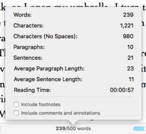 To see more statistics, click on the word count and this opens up a statistics pane, which is a tad more detailed than the Scrivener 2 version.
 - On the right-hand side, we have the progress bar still. The colour has changed! It’s blue!
The new defaults are blue (start/midway), green (end), pink (overflow). If you hate them … you can change them: via Scrivener / Preferences / Appearance / Target progress bars.

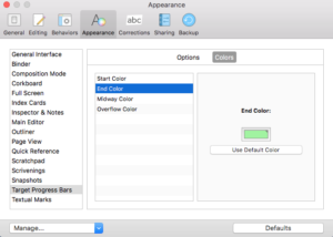
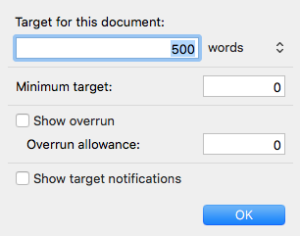
- There is no bulls’ eye but, if you click on the progress bar, the target window opens. It offers more than the Scrivener 2 version … even more to explore!
 Then there is a new icon: a page with a tick on it,
  indicating that this document will be included when the manuscript is compiled. If you want it excluded, click on the icon, and the tick changes to a cross. It’s a toggle button; click on it again and you are back the ticked version.
I think that’s enough excitement for one week! Next time, I’ll continue across the bottom line, looking at the Corkboard and the Outline view.
Questions about Scrivener? Need a helping hand? Want a demo?
To watch me go through the process of including images in a Scrivener project or to ask any questions, book a Simply Scrivener Special.
To help me to prepare, you could also complete this short questionnaire.
The ScrivenerVirgin blog is a journey of discovery:
a step-by-step exploration of how Scrivener can change how a writer writes.
To subscribe to this blog, click here.
Also … check out the Scrivener Tips
on my ScrivenerVirgin Facebook page.


No Comments