
Scrivener 3’s revised user interface – The Inspector
Meet the Inspector
While the Editing pane can show your Scrivenings, your Corkboard or your Outliner view, there is also an option to view the Inspector.
The Scrivener workspace
The basic workspace can be separated into three panes:
- The Binder on the left
- The Editing pane in the centre
- The Inspector on the right
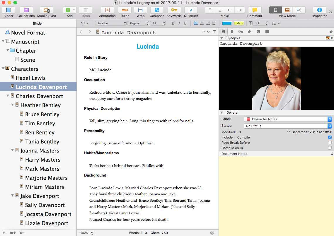
In Scrivener 2, with the Inspector ‘open’, it looks like this.
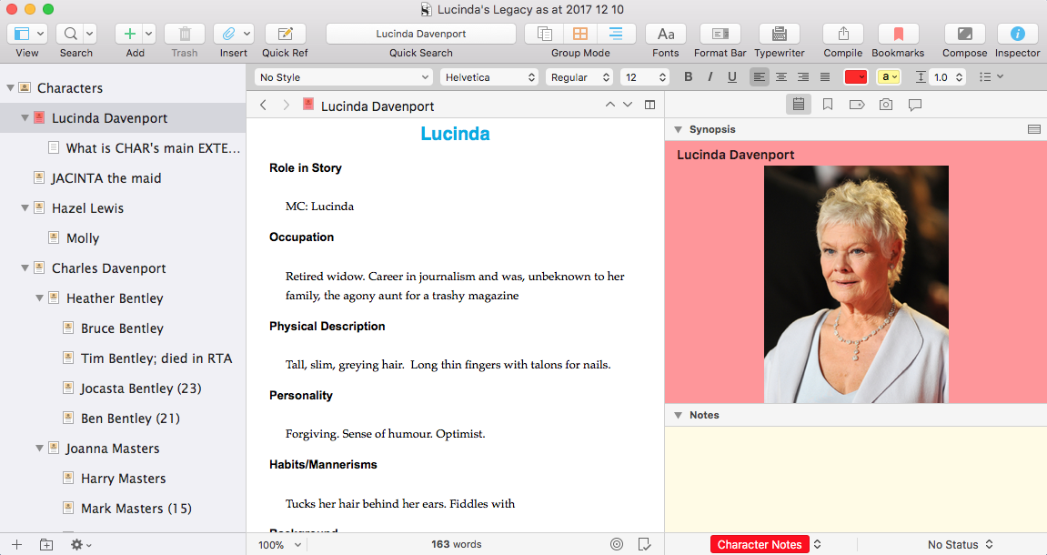
In Scrivener 3, there’s a new look to the Inspector pane.
What’s changed?
 The Inspector icon has been redesigned:
  an italic i instead of a Roman version!
It’s still a toggle button: click it to open the Inspector; click again to close it, and so on.
The Label and Status have moved
In Scrivener 2, the Label and Status controls are within the General pane. 
In Scrivener 3 they appear at the bottom edge of the Scrivener window.![]()
Clicking on the up/down arrow reveals the various Label options and Status options.
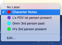
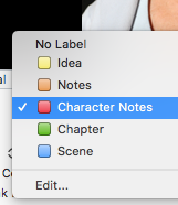 There is no difference between Scrivener 2 and Scrivener 3, except the shape: the coloured squares are now circles!
Things do start to change if you select Edit … but we’ll worry about that another time!
The Inspector options
This is where the fun starts!
In Scrivener 2, the Inspector options are displayed at the top of the pane and comprise six icons: ![]()
- Notes: displaying the Synopsis, the General pane and within that the Document/Project Notes
- References: as for Notes but the Document/Project Notes are replaced with Document/Project References
- Keywords: as for Notes but the Document/Project Notes are replaced with Keywords
- Custom meta-data: as for Notes but the Document/Project Notes are replaced with – you guessed it! – custom meta-data
- Snapshots: is just snapshots …
- Comments & Footnotes: is just comments and footnotes …
In Scrivener 3, it is different in that we have five icons instead of six – and there’s been a bit of redesign, although they are still similar enough to be recognizable.![]()
- The Notes are as before except Project Notes have moved … more on that in a mo.
- References is now called Bookmarks, but still has both Document and Project (References) Bookmarks
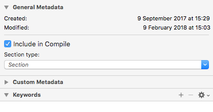 The two icons for Keywords and Custom meta-data are combined into one: called Meta-data. Within this, there is also the General Metadata – when created and modified, and whether this document is to be included in the Compile. And, NEW!, the Section type. More on that another day.
- The Snapshots is the same.
- Ditto for Comments & Footnotes.
So, the big question is:
What happened to the Project Notes?
To quote the manual (section E5, page 829) ‘Project notes are dead, long live project notes!’
The decision to revamp Project Notes was a major decision for Literature & Latte – so much so that they wrote a blog post to explain it.
That’s enough excitement for one day … but if you have …
Questions about Scrivener? Need a helping hand? Want a demo?
To watch me go through the process of customising the Corkboard view, and all these features, or to ask any questions, book a Simply Scrivener Special.
To help me to prepare, you could also complete this short questionnaire.
The ScrivenerVirgin blog is a journey of discovery:
a step-by-step exploration of how Scrivener can change how a writer writes.
To subscribe to this blog, click here.
Also … check out the Scrivener Tips
on my ScrivenerVirgin Facebook page.


Pingback:Scrivener Advent Calendar: I is for ... - ScrivenerVirgin
18 December 2024 at 06:46