Upgrading from Scrivener 2 to Scrivener 3: The revised user interface
User interface?
At the top of Literature & Latte’s list of improvements for Scrivener 3 is the revised user interface.
What’s the user interface?
When you open up Scrivener, whichever version you are using – or any other application, for that matter – you are presented with a window and that’s your user interface.
The interface is crammed full of features: icons you can click, menus that drop down, options all over the place. It’s like the front door – except you have so much to choose from, maybe you are not sure which way to go. Left? Right?
It’s your user interface – you are the user
Interacting with a piece of software requires you to choose the various features that will help you to achieve whatever it is you are trying to do. It’s your route to communicating your requirements, to make things happen.
In the same way that, as a road user, you learn the road signs and how to navigate from A to B, with any piece of software, you also need to be able to read the signs. And you need to work out how to get from here to there, wherever ‘there’ is for you.
The Scrivener user interface signposts
The initial entry points for features are arranged around the edges of the application window. For Scrivener, there are three ‘menus’ at the top of the window: main menu, toolbar, format bar. I’m looking at these in this post.
There are also other areas of importance – at the bottom of the window and within the Inspector area – which I’ll examine in subsequent posts.
Back to the top line …
Main menu
This is the main menu for Scrivener 2:
![]()
The new one for Scrivener 3 has two additional entries: Insert and Navigate.
![]()
There are also changes in what appears, should you click on any of the options; we’ll look at those enhancements in subsequent posts.
Toolbar
This is the toolbar for Scrivener 2:
The new one for Scrivener 3 is has lots of changes!

I already mentioned – in this blog post – the fact that the reveal/hide options for the Binder/Collections have been combined into one icon. Also, that the Search has moved from the right-hand end to the left-hand end.
If you move your cursor across each icon, its Alt text appears, revealing its function. Several are simply redesigns of the icon image:
- The plus sign still means ‘Add’
- The trash can still mean ‘Trash’
- The Group Mode icons still mean Scrivenings, Corkboard and Outliner
and so on.
Some are brand new though:
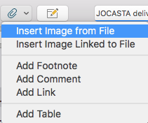
- The paper clip offers the options to insert images, footnotes, comments, links and tables.
- There’s a new field which appears to be displaying the currently selected folder/document name. For fun, hover near that and see what happens!
The toolbar design is a revamp, so it’s worth spending a few minutes checking what each icon does, and becoming familiar with their (new) position.
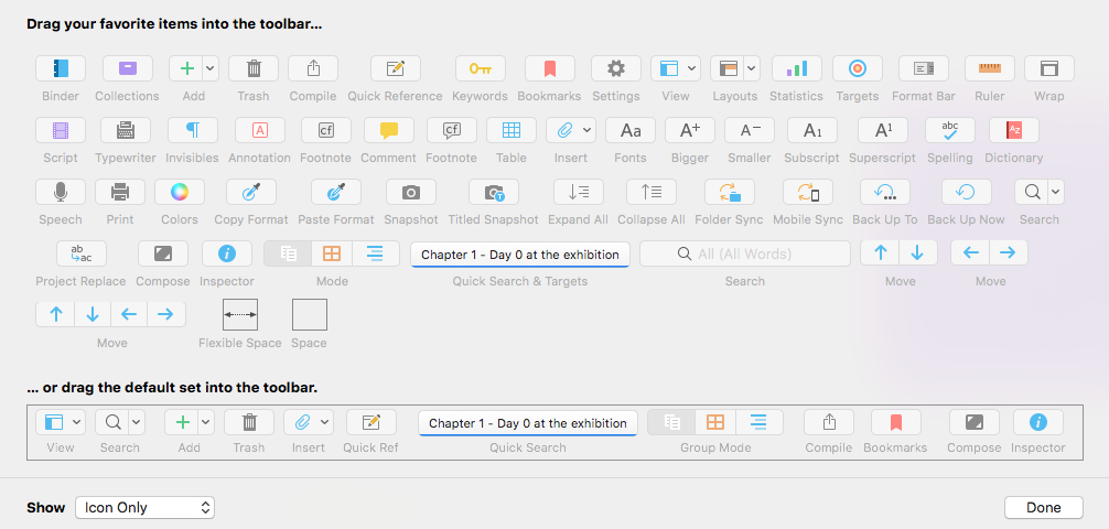
Of course, you still have the option to customise the toolbar. Right clicking in that area will open the complete set of icon options and you can drag them into your toolbar area and/or drag unwanted one back into the pool.

Format bar
This is the Format bar in Scrivener 2:
![]()
The Scrivener 3 version is almost the same …
![]()
But, on the left, there are two new fields:
- A Search field
- The new ‘Styles’ feature … lots to learn about style – which, if you can wait, will appear in a subsequent series of posts.
Questions about Scrivener? Need a helping hand? Want a demo?
To watch me go through the process of including images in a Scrivener project or to ask any questions, book a Simply Scrivener Special.
To help me to prepare, you could also complete this short questionnaire.
The ScrivenerVirgin blog is a journey of discovery:
a step-by-step exploration of how Scrivener can change how a writer writes.
To subscribe to this blog, click here.
Also … check out the Scrivener Tips
on my ScrivenerVirgin Facebook page.


Robert
28 January 2018 at 01:53Getting an idea of what styles are and how/when to use them would be a good blog subject.
Anne Rainbow
28 January 2018 at 06:19Thanks Robert. Yes, it will and I have a series of blogs planned to cover this new development. Scrivener 3 provides so many more features, and have tweaked such a lot – it might take a while to cover them all!