Editing pane options: Corkboard
It’s all about the Corkboard!
The three Editing pane options are: your Scrivenings, your Corkboard or your Outliner view.
- In the previous post, I looked at Scrivenings.
- Next time, I’ll focus on the Outliner view.
- Today, it’s all about the Corkboard.
Why use the Corkboard?
The Corkboard is not compulsory! To write your text, you need Scrivenings, but you need not venture further into the Editing pane options if you’d rather not.
However, the Corkboard, once you start to use it, can become indispensable. It provides an overview of the structure of your manuscript.
- The Corkboard helps planners to plan: creating their outline.
- The Corkboard helps pantsers to document what they’ve produced to date.
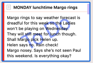
Scrivener displays two items of metadata on each card.
You can also customise via View / Corkboard Options to display three more items of metadata.
- The Status Stamp: To Do
- The Label: the red strip indicates Helen’s location = At home
- Keywords: The lilac chip indicates Margo is in this scene. This novel is written in first person present from Helen’s POV, so she is in every scene – no need for a keyword chip for her.
Outlining in Scrivener
Each to their own but, when I start writing a novel, I use Scrivener from the outset. Other writers might start on paper and only when they can see the whole plot will they start setting up the structure, electronically. And there are other software tools, too. But for me, it’s Scrivener from start to finish!
One scene at a time – one card at a time
I use one text document per scene and this equates to one card on the Corkboard per scene.
What is a scene? My definition of a scene is simple:
- A scene happens at one time.
- A scene has a fixed cast of characters.
- A scene happens in one physical location.
So, if the action jumps to a different location, and/or a character enters or leaves, and/or there is a break in time, I start a new scene. A new card!
For Chapter 19, there are four cards on the Corkboard.
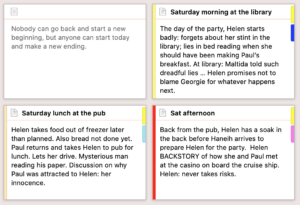 The first card is used for the chapter ‘saying’ which appears just after the chapter title.
- There are then three scenes at three different times of the day: in the morning, lunch time and in the afternoon.
The coloured strips to the left of each scene card indicate three different locations set up using the Label metadata:
- In the Library
- At the pub
- At Helen’s home: High View

The coloured keyword chips on the right of each card show which characters are in this scene with Helen.
Using scenes to convey a character arc
Because my novel is character driven, I begin by creating one character sketch, mapping out that character’s arc and deciding what scenes might be needed.
- What events will that character attend?
- Which facts about that character need to be revealed? How and when will this happen?
- What conversation will he/she have and with whom?
If you are writing a plot-driven novel, you’ll tackle this differently but, any which way, I’ll show you the Scrivener features and tools which might help you to set up your outline quickly and easily on the Corkboard. Read on!
Setting up the Scrivener workspace for outlining the scenes
For outlining purposes, I set up my Editing pane with split screens: the Corkboard view on the left and a character sketch on the right.
This shows the state of my Dead Wood novel just before NaNoWriMo 2018: with many scenes outlined and sort-of in order. 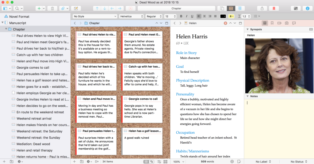
At this stage, I was just throwing my thoughts onto cards. These synopses would then provide me with a prompt when the real writing started at midnight on 31 October.
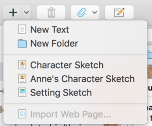
To create each new card:
- click on the + sign at the bottom on the Editing pane
- OR click the Add button in the top menu bar and select New Text
- OR right click and choose Duplicate as this automatically copies the target of (say) 500 words you’ve set for each scene.
I then write a title at the top of the card, and the synopsis below that. Simple!
Using dummy cards to decide scene groupings into chapters
Once I’ve completed the first draft, I insert dummy cards when trying to decide how to group my scenes into chapters. Later, I turn these dummy documents into folders, and drag the scenes (documents) that belong with that chapter into that folder.
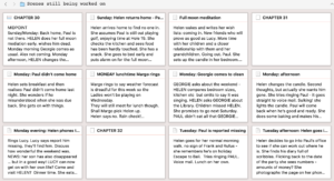
The Corkboard in the Scrivener workspace for later drafts
Roll on two years and I’m still using the Corkboard, but my scenes have now been grouped into chapters. Selecting Manuscript in the Binder reveals my chapter cards and, on each of those, I’ve now written a chapter synopsis.
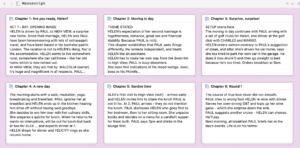
At this stage, I’m looking at the balance and structure (as per a variation of the 3-act structure), making sure no sections are too long, and that everything is in the correct place.
Using the option ‘arrange by label’ to intertwine threads
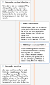
As with the chapter cards that I used to help me to group my scenes, at this stage, I use dummy cards to remind me of the police activity (which is not ‘told’ to the reader until later), alongside Helen’s account of life as she is experiencing it.
None of these ‘scenes’ are included in the Compile.
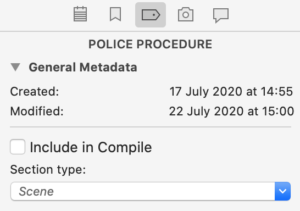
To see how the police action fits between the scenes as Helen portrays them (and the reader learns what’s going on), I opt for the ‘Arrange by label’ display of the corkboard.
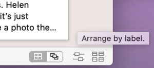
NB This feature is not available in Scrivener 2.
Managing the Corkboard interface
In Scrivener 3, the Corkboard bottom line – which is your interface to control the Corkboard – looks like this.![]()
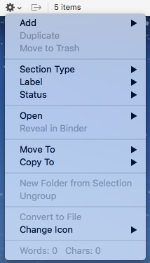
Working from the left
- The + sign is used to create a new document.
- The folder icon with a plus sign is used to create a new folder.
- The cogwheel reveals a drop-down menu. Notice that this includes options to change the Section Type, Label and Status.
![]() The next symbol shows three sides of a square with an arrow pointing to the right. This tool is only available when you have split panes. Then, if activated, when you click on one of the corkboard cards, Scrivener automatically opens the selection in the other editor. So if you want to flick through the cards, on the left (say), on the right, you’d see the text for the selected document. If you have split panes and you don’t want this to happen, make sure this option is turned off (greyed out rather than blue)!
The next symbol shows three sides of a square with an arrow pointing to the right. This tool is only available when you have split panes. Then, if activated, when you click on one of the corkboard cards, Scrivener automatically opens the selection in the other editor. So if you want to flick through the cards, on the left (say), on the right, you’d see the text for the selected document. If you have split panes and you don’t want this to happen, make sure this option is turned off (greyed out rather than blue)!
Then there is a count of the number of items.
On the right, there are four icons. The first two are alternative views of the Corkboard: as a Grid, or Freeform.
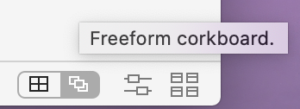
If you opt for Freeform, a Commit button appears, allowing you to ‘commit’ to the new arrangement – and this results in the order of documents in the Binder being changed to match whatever rearrangement you have done on the Corkboard.

The next icon resulted in the Label view you’ve seen already in this blog post. You can, if you wish, opt for a horizontal layout.
If you select more than one folder in the Binder, the View Mode icon changes, offering three View Modes for the cards: Grid, Horizontal, Vertical.

The Grid option presents all the cards for all the selection you’ve made in the Binder.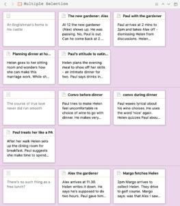
The other two options string out the cards, horizontally or vertically according to your choice.
Finally, skipping to the righthand icon, this provides controls for card size, ratio, spacing, cards across and keyword chips.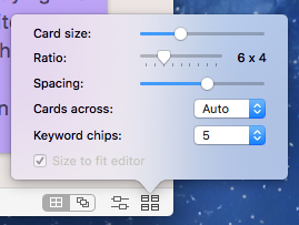
Customising: the index cards
Although you can control the view of cards on the Corkboard using the icon on the bottom right of the Editing pane (image above), there are also options within Scrivener / Preferences / Appearance.
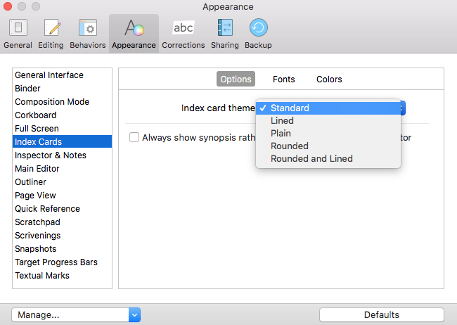
Click on the entry for Index cards. It has three tabs: Options / Fonts / Colors. The Options tab allows you to change the shape of the card, and to determine whether it has lines on it.
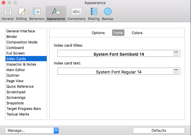
In the Font’s tab, you can control the font for both the card title (the document title) and the text on the card (the synopsis).
The Colors tab allows you to control the background colour of the card, plus the Status Stamp colour. (Status Stamp colour is also customisable on the Corkboard / Colors tab.)
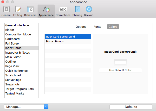
Customising: the Corkboard
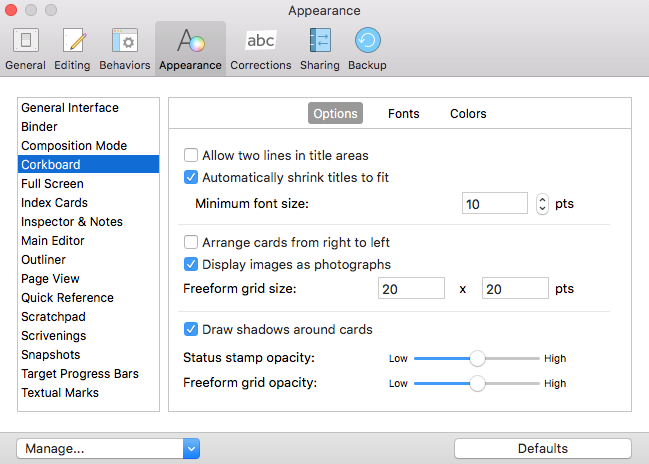
To customise the appearance of the Corkboard itself, select the Corkboard tab. The Options tabs has lots of options as shown below.
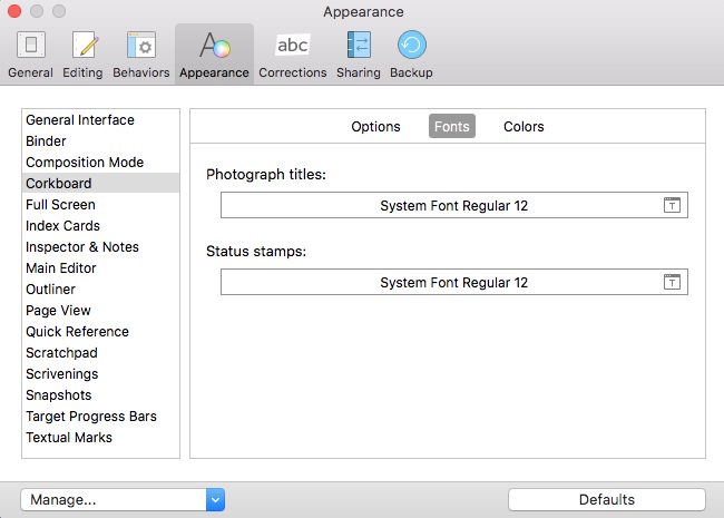
The Fonts tab offers the option to customise the fonts for Photograph titles and for the Status Stamp.
The Colors tabs is used to customise the background of the Corkboard.
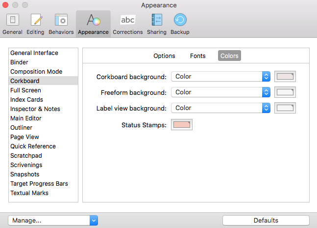
If you liked the ‘corkboard’ effect that came with Scrivener 2, rather than a plain colur, select Corkboard Effect.

Notice you can, if you wish, set up a custom background. Enjoy!
Questions about Scrivener? Need a helping hand? Want a demo?
To watch me go through the process of customising the Corkboard view, and all these features, or to ask any questions, book a Simply Scrivener Special.
To help me to prepare, you could also complete this short questionnaire.
The ScrivenerVirgin blog is a journey of discovery:
a step-by-step exploration of how Scrivener can change how a writer writes.
To subscribe to this blog, click here.
Also … check out the Scrivener Tips
on my ScrivenerVirgin Facebook page.


Pingback:Scrivener Advent Calendar: O is for ... - ScrivenerVirgin
18 December 2024 at 06:42Jesse G
21 January 2024 at 21:17The corkboard background is still there. You just have to choose “corkboard pattern” from the options menu.
File>Options>Appearance>Corkboard
Anne Rainbow
21 January 2024 at 22:35Well spotted. thank you. I’ve amended the post accordingly.